Indicators Description
A detailed guide to using GetChart's professional tools.
The materials provided are for informational purposes only and are not financial advice. We encourage you to conduct your own market analysis, carefully evaluate risks, and develop individual trading strategies.
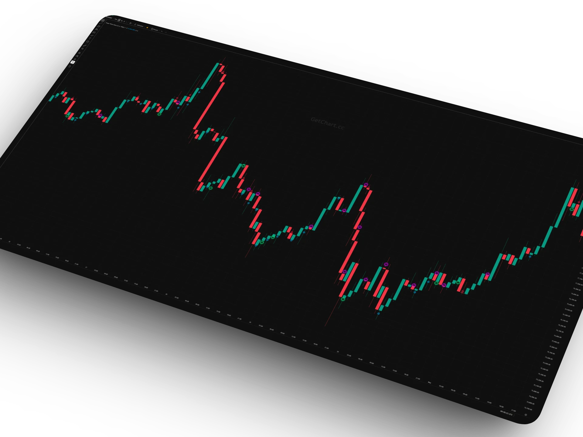
LIQUIDATION HEATMAP
This indicator visualizes the market's "magnetic zones" — price levels where a significant number of liquidations for highly leveraged traders are accumulated. The server analyzes data and builds a heatmap where the line brightness corresponds to the volume of potential liquidity.
The algorithm adapts to the selected timeframe. On 1M-1W, global "whale" levels are displayed, calculated based on the historical data of the last 2 years. On smaller timeframes (1H — 1D), the indicator focuses on fresh, local liquidity pools for intraday trading.
How to use?
- Golden Lines: Mega-levels (whales). The strongest support/resistance zones.
- Green / Red: Liquidations of longs and shorts.
- Use as targets for Take Profit.
- Price often reverses after "sweeping" liquidity.
CVD PANEL
Cumulative Volume Delta (CVD) displays the difference between aggressive buying and selling volumes (Market Orders), accumulated over time. It is the market's "X-ray" that shows who truly dominates — buyers or sellers, regardless of price movement.
Our algorithm automatically calculates Smart Divergences. If the price makes a higher high, but the CVD line drops (the aggressive buyer is gone), the indicator signals trend weakness with a corresponding marker. This allows finding reversals before they become obvious on the price chart.
How to use?
- Trend Analysis: CVD grows along with the price = healthy trend.
- Divergences: Price ↑, but CVD ↓ (or vice versa) — a signal for reversal.
- Absorption: A sharp spike in CVD without price movement means limit orders are holding the level.
ALMA RIBBON
ALMA Ribbon (Arnaud Legoux Moving Average Ribbon) is a combination of four moving averages of different periods, creating a "wave" or "ribbon." Unlike traditional moving averages, ALMA uses Gaussian distribution, which helps remove market noise without lagging behind the price.
The indicator serves as an ideal trend filter. The market state is determined by the price position relative to the ribbon and the order of the lines themselves (Short, Medium, Long, Very Long). This allows clearly seeing phases: impulse, correction, or uncertainty (ranging/flat).
Trading Logic
- Bullish Trend (Long): Price is ABOVE all lines. Lines expand, arranging in the order: Green > Yellow > Red > Blue. Entry on pullbacks to the Green/Yellow line.
- Bearish Trend (Short): Price has closed BELOW the ribbon. The line order is mirrored. The ribbon acts as dynamic resistance.
- Flat / Do not trade: Lines are intertwined, or the price "whipsaws" through the ribbon. Trend is absent.
- Reversal (Golden Cross): Price breaks the longest (Blue) line, and short lines (Green) begin to cross the long ones from bottom to top.
BOLLINGER PRO (SQUEEZE)
This is an improved version of the classic Bollinger Bands, which solves the trader's main problem — identifying market phases. The algorithm automatically calculates the average channel width over 120 bars and highlights zones of abnormally low volatility (Squeeze).
When the lines turn grey ("Neck"), it means the market is accumulating energy. The longer this phase lasts, the stronger the subsequent price breakout will be. The indicator also has a built-in "Traps" detector — situations where a market maker sweeps stops outside the channel, but the price instantly returns inside.
Trading Logic
- Grey Lines (Squeeze): "The calm before the storm." Do not trade inside, but place pending orders for a breakout of this range.
- Blue Lines (Expansion): Start of a trend. If a candle closes outside the grey zone — enter in the direction of the breakout.
- Trap Sell: Price made a High above the upper line, but the candle (red) closed inside the channel. Signal for short (reversal).
- Trap Buy: Price made a Low below the lower line, but the candle (green) closed inside. Signal for long.
VOLUME DELTA CANDLES
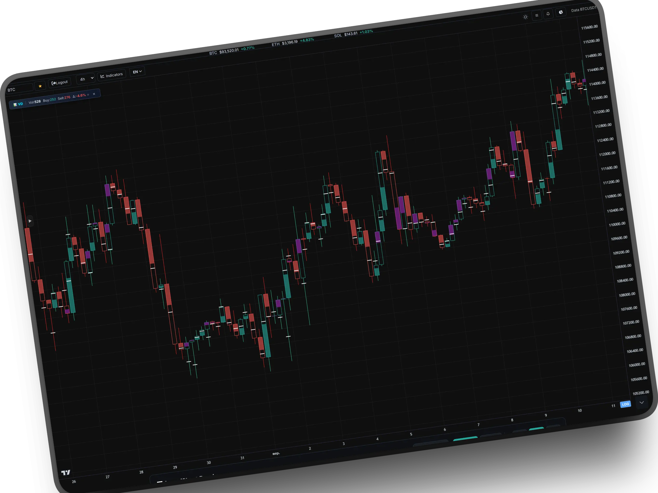
Volume Delta Candles is an extension of classic candles that shows not only price movement but also the balance of volumes between buyers and sellers (Delta). Instead of coloring by price, candles are colored by volume dominance.
The indicator analyzes aggressive orders (market orders) and shows whether buyers or sellers dominate in each candle. If the candle is green — buyers are aggressive, if red — sellers. Purple color signifies a contradiction between price and volumes — trend weakness.
Additionally, the Point of Control (POC) is displayed — the level where the largest volume of trades occurred. The thickness of the candle's coloring is proportional to the strength of the volume imbalance.
How to read?
- Green Candle: Aggressive buyers dominate. Uptrend confirmed by volumes.
- Red Candle: Aggressive sellers dominate. Downtrend confirmed by volumes.
- Purple Candle: Price moves in one direction, but volumes — in the other. Signal of trend weakness.
- White line in the middle: Point of Control (POC) — level of maximum volume.
- The thicker the coloring — the stronger the volume imbalance.
COMBINED RSI + BB
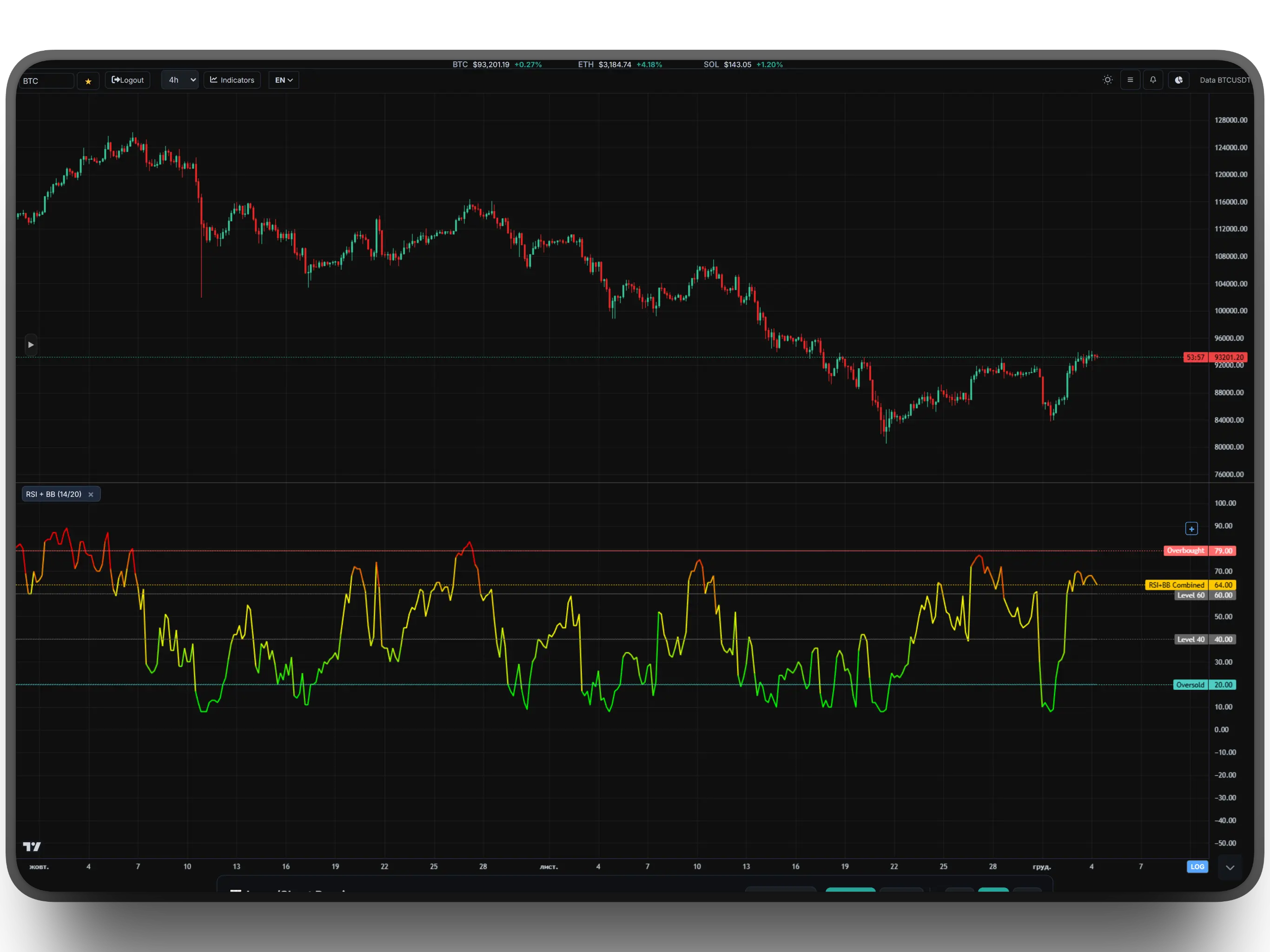
This is a "super-oscillator" that solves the main problem of the ordinary RSI — false signals during strong trends. The indicator mathematically combines RSI (strength of movement) and Bollinger Bands %B (price position relative to volatility), normalizing them into a single scale from 0 to 100.
The line changes color dynamically: from green (extreme oversold) through yellow (neutral zone) to red (extreme overbought). This allows for an instant assessment of the market state without overloading the chart with unnecessary lines.
Color Logic
- Red Zone (>79): Critical overbought. High probability of a reversal down or a correction.
- Green Zone (<20): Critical oversold. A good zone to look for Long entry points.
- Yellow Zone (40-60): Market in balance or in a steady trend. Better to refrain from opening counter-trend positions.
VOLUME INDICATOR
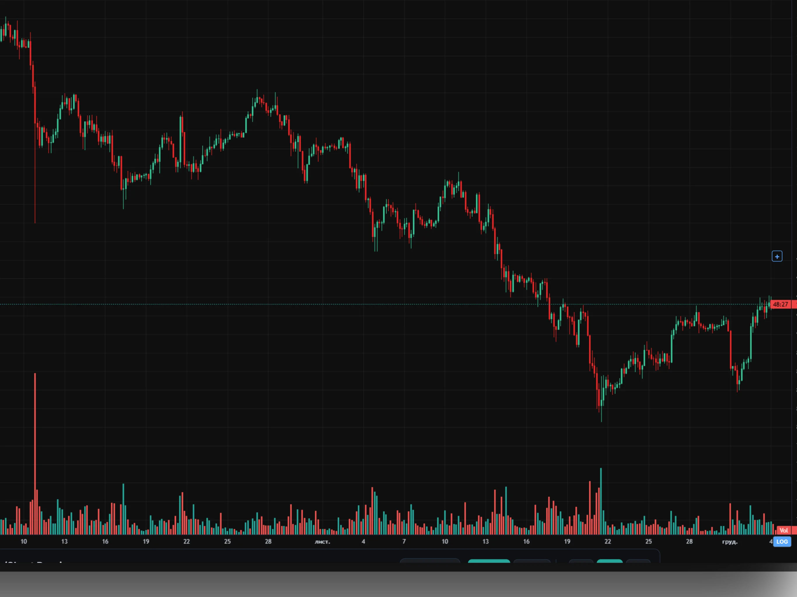
Volume Indicator is a classic tool that displays the volume of trades for each candle as vertical bars. Each bar shows the total activity of the market for a specific period.
The coloring of the bars corresponds to the direction of the price movement: green — the candle closed higher than it opened; red — the candle closed lower than the open.
Volume is the "fuel" of the movement. High volume during a breakout confirms the strength of the move. Low volume during a move — a signal of weakness, a possible false breakout.
How to interpret?
- High Green Bars: Strong buyer interest. Confirmation of an uptrend.
- High Red Bars: Strong seller pressure. Confirmation of a downtrend.
- Volume Peaks on Breakouts: Confirm the authenticity of level breaks.
- Low Volume on Correction: Healthy correction within a trend.
- Sharp Volume Spike: Often accompanies a reversal or the start of a new impulse.
COMBO PANEL (DIVS + PIVOTS)
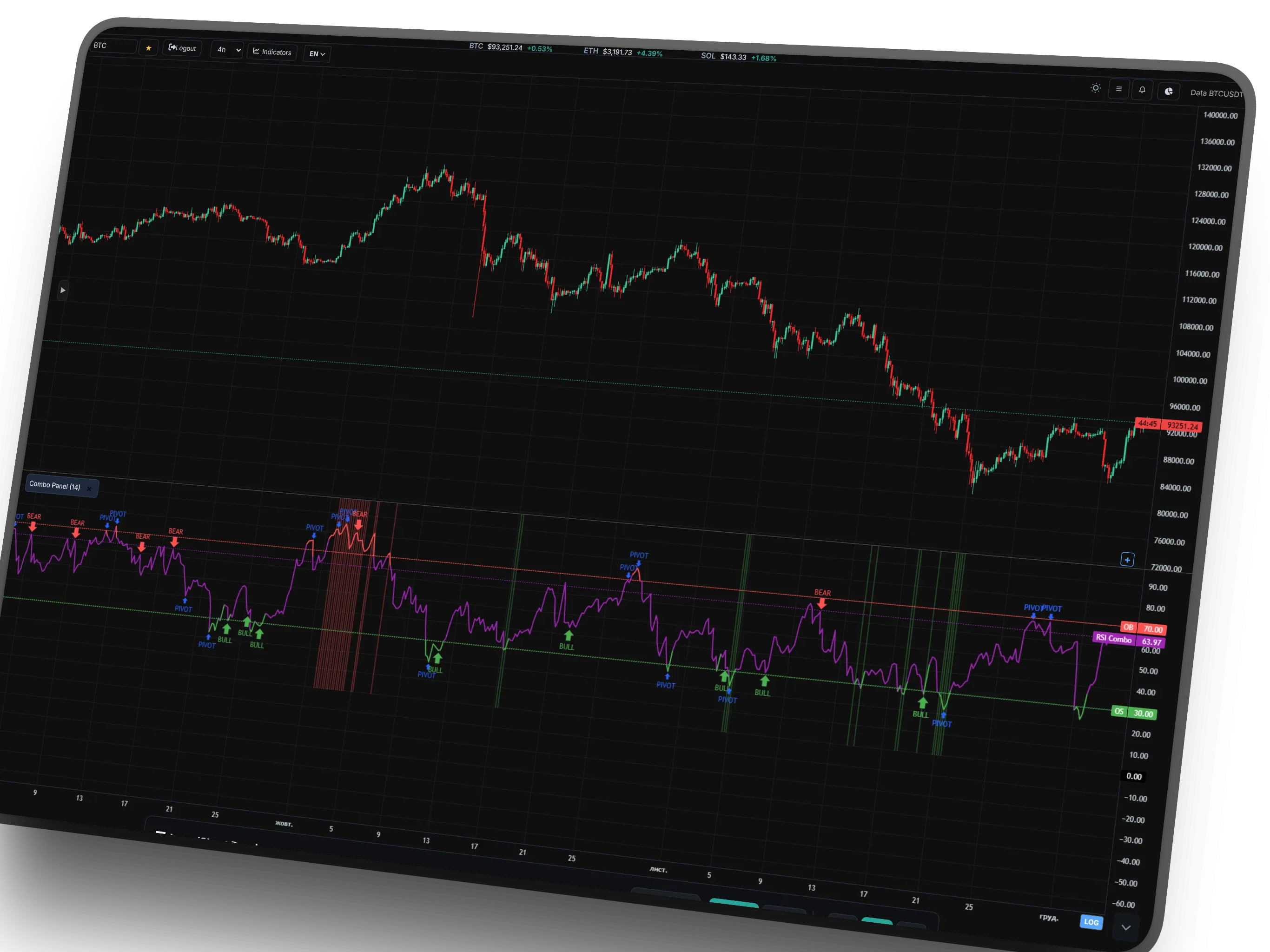
This is the flagship oscillator of the terminal, combining 5 different algorithms into one panel to find the ideal entry point. The main line is a modified RSI that changes color depending on the overbought/oversold zones.
The main feature is Combo Signals (colored background). This signal appears ONLY when there is complete synchronization (Confluence) of five indicators: RSI + Stochastic + EMA Trend + Keltner Channels + Envelopes. This filters out 90% of market noise, leaving only the strongest moments of trend exhaustion.
Signal System
- Global PIVOT: "PIVOT" markers show global reversals (90-candle analysis).
- BEAR / BULL Divs: Automatic search for divergences (discrepancy between price and RSI).
- Green Background: Extreme buying zone (price has broken outside Keltner Channels/Envelopes + oscillator oversold).
- Red Background: Extreme selling zone.
TDI INDICATOR
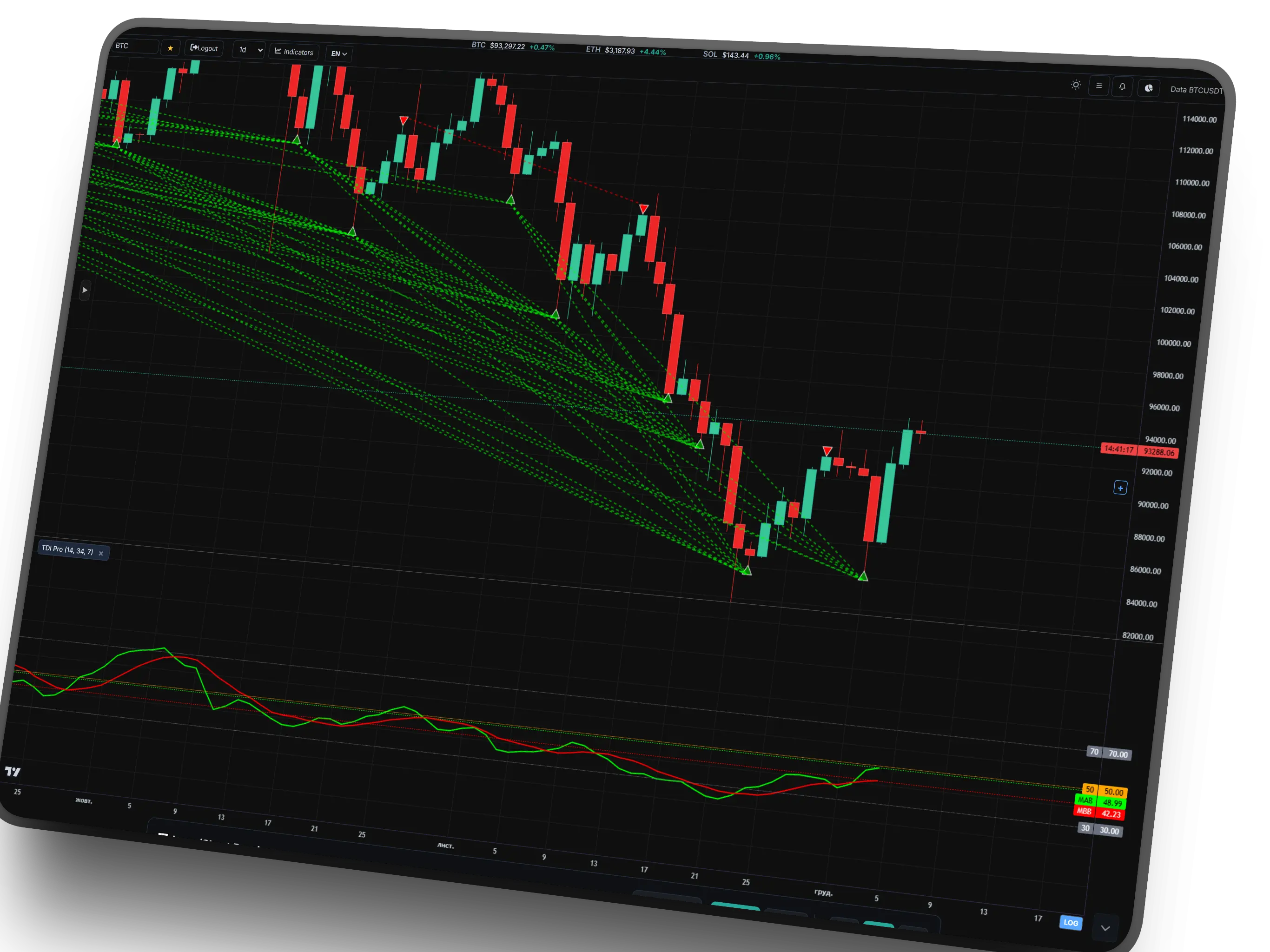
TDI (Traders Dynamic Index) is a powerful multi-component indicator that combines RSI, moving averages, and divergences. It works in a separate window below the chart and simultaneously displays several levels: upper, lower, and middle lines.
The basis of TDI is RSI with a specific period, around which Bollinger Bands are built to determine overbought/oversold conditions. Additionally, two moving averages (MAB and MBB) help determine momentum dynamics.
The indicator automatically searches for divergences between price and RSI, marking them with triangles on the chart and dashed lines. This allows catching reversal moments even before the price structure changes.
Signal Logic
- Upper/Lower Lines: Dynamic overbought/oversold levels.
- Middle Line: Market balance zone.
- MAB and MBB: Criteria for entering a position upon crossing.
- Green Triangle: Bullish divergence (price ↓, RSI ↑).
- Red Triangle: Bearish divergence (price ↑, RSI ↓).
- Line Crossing: MAB above MBB — bullish impulse, vice versa — bearish.
COMBO SIGNALS (ON-CHART)
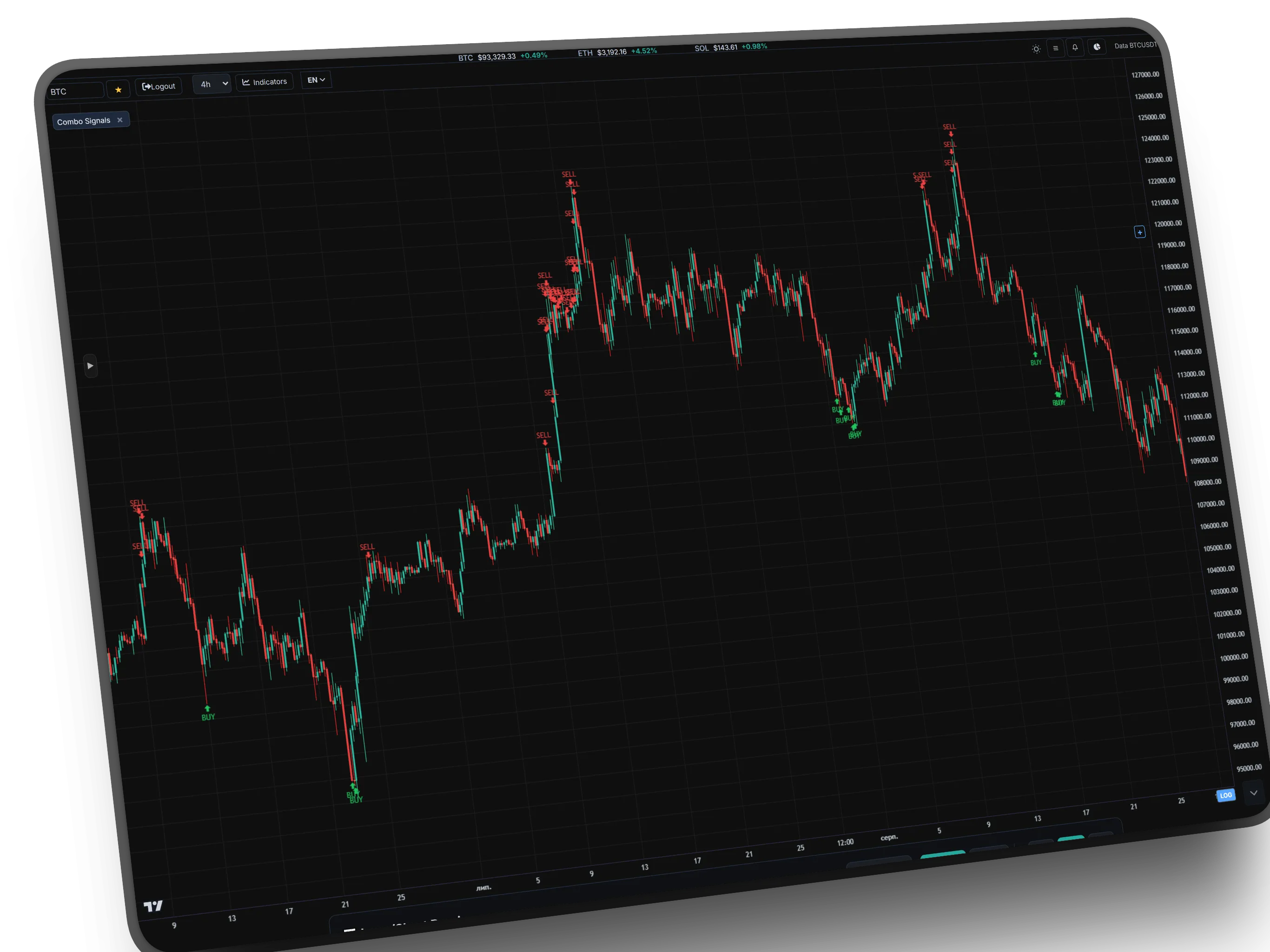
If Combo Panel is a radar, then Combo Signals is the guidance system. The indicator works directly on the price chart, keeping it as clean as possible. It does not draw unnecessary lines but places an entry marker only at the moment of the "Perfect Storm."
The algorithm analyzes the confluence of four factors: overbought/oversold by RSI and Stochastic, moving average (EMA) crossing, and price breaking out of Keltner Channels/Envelopes. Only when all these conditions are met simultaneously does the system provide a signal. This filters out up to 90% of false entries in a ranging market.
Signal Types
- BUY / SELL: Basic signal. Price broke out of volatility (Bands) + momentum reversal (RSI/Stoch) + trend confirmation (EMA).
- S-BUY / S-SELL (Strong): Enhanced signal. All basic signal conditions PLUS the presence of a divergence or a candlestick pattern (Hammer/Star).
- Smart Filtering: Signals do not appear inside the channel, which protects against trading in "noise."
SUPERTREND
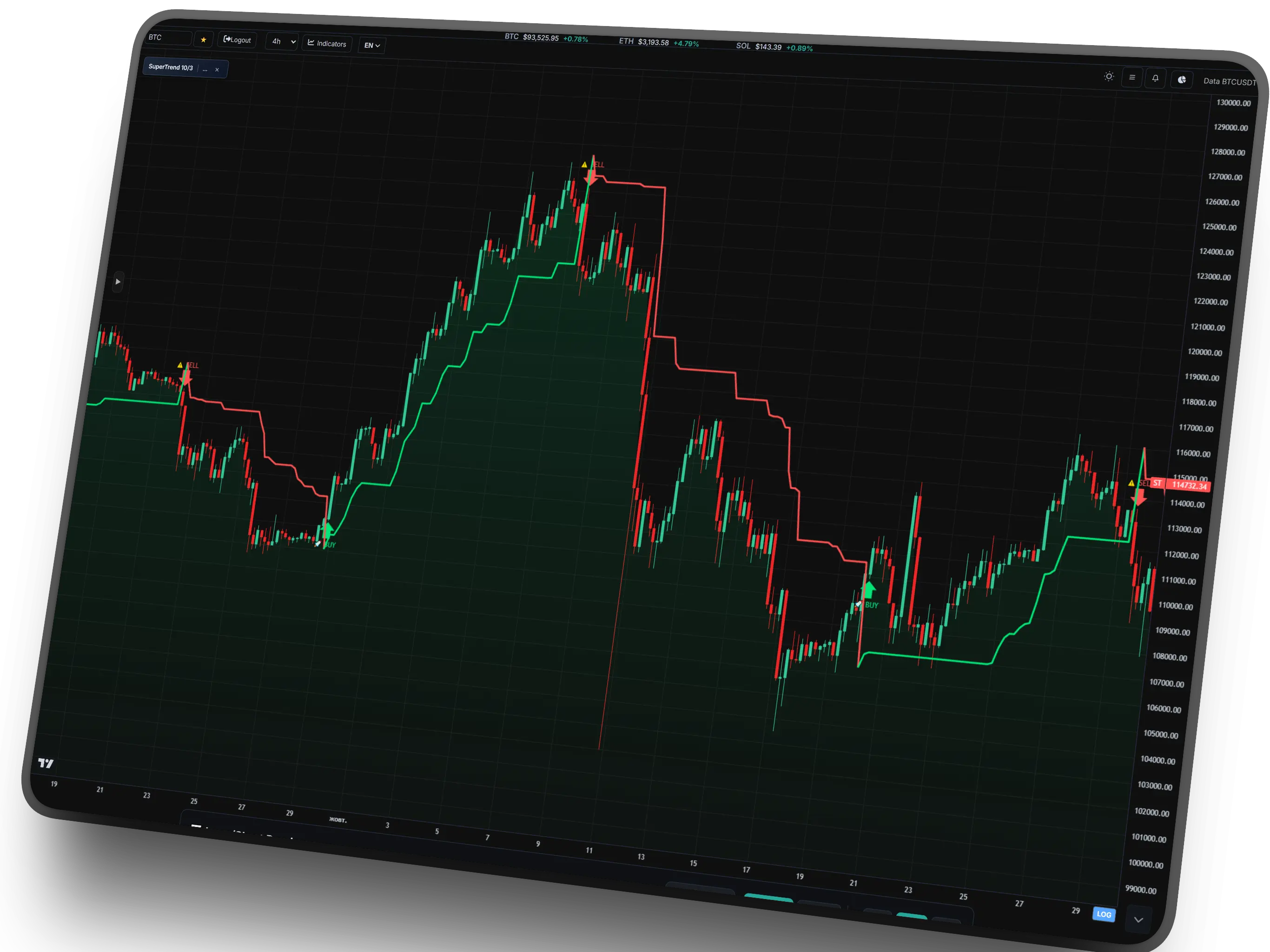
SuperTrend is a trend-following indicator that automatically adapts to market volatility. It is built based on ATR (Average True Range) and allows clearly defining the current trend direction and its change points.
The indicator has two modes: Long (green) and Short (red). When the price is above the SuperTrend line — a bullish trend is active. When the price falls below the line — a bearish trend.
SuperTrend generates automatic signals for entry/exit: an upward arrow 🚀 — a buy signal, a downward arrow ⚠️ — a sell signal. The filled area between the price and the trend line visualizes the strength of the impulse.
The thicker the SuperTrend line — the older and stronger the trend. The indicator also shows the trend duration in bars and its profitability in percent.
Trading Strategy
- Buy: When the price crosses the SuperTrend from bottom to top and the line turns green. Entry after the 🚀 arrow appears.
- Sell: When the price crosses the SuperTrend from top to bottom and the line turns red. Entry after the ⚠️ arrow appears.
- Take Profit: When the trend changes to the opposite (color change of the line).
- Stop Loss: Always placed behind the SuperTrend line (if long — stop below the line, if short — above the line).
- Filter: Trade only when the trend lasts more than 5 bars to avoid false signals.
- Trend Strength: The thicker the line — the more reliable the signal.
GUD GURU CHANNEL
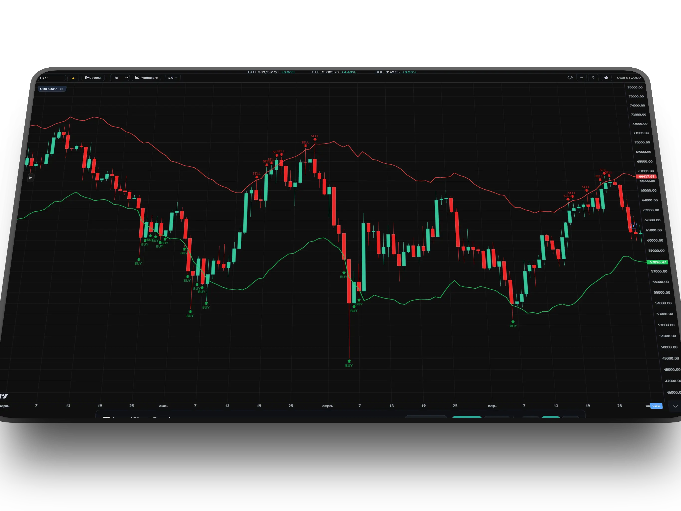
This is an exclusive proprietary development for working with strong assets (BTC, ETH, SOL). Gud Guru is not just a channel; it is a mathematically calibrated adaptive volatility algorithm that filters out all market "noise" and leaves only the true price boundaries.
On higher timeframes (1D, 1W), the indicator demonstrates phenomenal accuracy, approaching 100%. History shows that the price almost always reacts and bounces when touching the outer lines. This is a tool that removes emotion and helps make the only correct decision at a critical moment.
"Sniper" Strategy
- Bottom Line (Bottom): "Rock-solid" floor. Ideal zone for accumulating long-term Long positions.
- Top Line (Top): Maximum overbought. Zone for profit taking or looking for Short.
- Base Line: Trend core. As long as the price is above — the trend is bullish.
- Recommended for 1D and 1W.
STOCHASTIC OSCILLATOR
Stochastic Oscillator is an oscillator that measures the closing position of the current candle relative to the entire price range over a specified period. It shows market momentum and helps identify overbought and oversold zones.
The indicator consists of two lines: %K (blue) — the main line, and %D (orange) — the signal moving average. When %K crosses %D from bottom to top — it's a buy signal. When it crosses from top to bottom — a sell signal.
Standard levels: 80 (overbought) and 20 (oversold). When the oscillator exceeds 80 — the market is overbought, a downward correction is likely. When it drops below 20 — oversold, an upward bounce is likely.
Our algorithm automatically finds divergences between price and stochastic. "Bull" — bullish divergence, "Bear" — bearish divergence. Live (unconfirmed) signals are marked with "Bull?" (blue) and "Bear?" (brick red).
Signals and Strategy
- Overbought: %K > 80 — possible downward correction. Expect sales.
- Oversold: %K < 20 — possible upward bounce. Expect purchases.
- %K and %D Cross: Buy when crossing from bottom to top in the oversold zone. Sell — when crossing from top to bottom in the overbought zone.
- Bullish Divergence: Price ↓, Stochastic ↑. Strong buy signal.
- Bearish Divergence: Price ↑, Stochastic ↓. Strong sell signal.
- Zone Filter: Bullish divergences only work when both lows are < 50. Bearish — when both peaks are > 50.
- Live Signals: Blue and brick red markers are still unconfirmed divergences and require additional confirmation.
GURU BB STRATEGY
This is not just an indicator, but an intellectual scoring system. The algorithm analyzes the market across six parameters simultaneously: price position in Bollinger Bands, trend on EMA, overbought/oversold by RSI, volume spikes, and Price Action patterns. Points are awarded for each "bullish" or "bearish" factor.
An entry signal appears only when the total score exceeds a defined sensitivity threshold. This allows filtering out weak signals and focusing only on moments of maximum confluence (coincidence of factors). The indicator labels each signal with the number of points scored (e.g., "BUY 8pts").
How to read signals?
- BUY / SELL: Standard signal. The minimum required number of points for entry has been reached.
- STRONG BUY / SELL: Powerful signal. Almost all factors coincided (RSI in zone, bounce from BB, volume confirmation).
- Pts (Points): Pay attention to the number of points next to the signal. The higher the number, the stronger the setup.
RSI PANEL
RSI Panel (Relative Strength Index) is an oscillator that measures the speed and change of price movement. It operates in the range of 0 to 100 and shows overbought and oversold zones.
Standard levels: 70 (overbought) and 30 (oversold). When RSI crosses 70 from below — the market is overbought, a correction is expected. When it drops below 30 — oversold, a bounce is expected.
Our implementation features improved divergence algorithms. The indicator automatically finds historical and LIVE divergences between price and RSI:
• "Bull" — bullish divergence (price ↓, RSI ↑) — a buy signal.
• "Bear" — bearish divergence (price ↑, RSI ↓) — a sell signal.
• "Bull?" and "Bear?" — live (unconfirmed) signals that require additional confirmation.
The indicator uses strict filters: bullish divergences only work when both lows are < 50; bearish — when both peaks are > 50.
Trading Tactics
- Overbought (≥70): Expect sales. Exiting longs, possible entry into shorts.
- Oversold (≤30): Expect purchases. Exiting shorts, possible entry into longs.
- Divergences: The strongest signals. Bullish — for buying, bearish — for selling.
- Zone 50 Filter: RSI above 50 — bullish sentiment, below — bearish.
- Live Signals: Do not act immediately. Wait for confirmation — either another candle or a level breakout.
- Zone between 30-70: Neutral, trend not defined. Watch for divergences.
GURU BB OSCILLATOR
This tool works on the principle of a "rubber band." It measures how far the price has deviated from its norm. The main strength of the indicator is in detecting divergences (discrepancies). These are situations where the price continues to grow inertially, making a new high, but the oscillator line is already heading down. This is a sure sign that the buyers' "fuel" has run out and a correction is looming.
The indicator automatically scans the chart for three types of signals: classic reversals (Regular Divs), trend continuation (Hidden Divs), and fast scalp entries (Fast Signals). But remember: the wider the discrepancy between the price chart and the oscillator — the stronger the reverse movement will be.
Signal Types
- BEAR Div (Bearish): Price ↑, Oscillator ↓. Signal for falling (Short).
- BULL Div (Bullish): Price ↓, Oscillator ↑. Signal for rising (Long).
- Hidden Div: Signal for the continuation of the existing trend after a pullback.
- Zero Line Cross: Crossing the central line — confirmation of a change in the local trend.
PIVOT POINTS
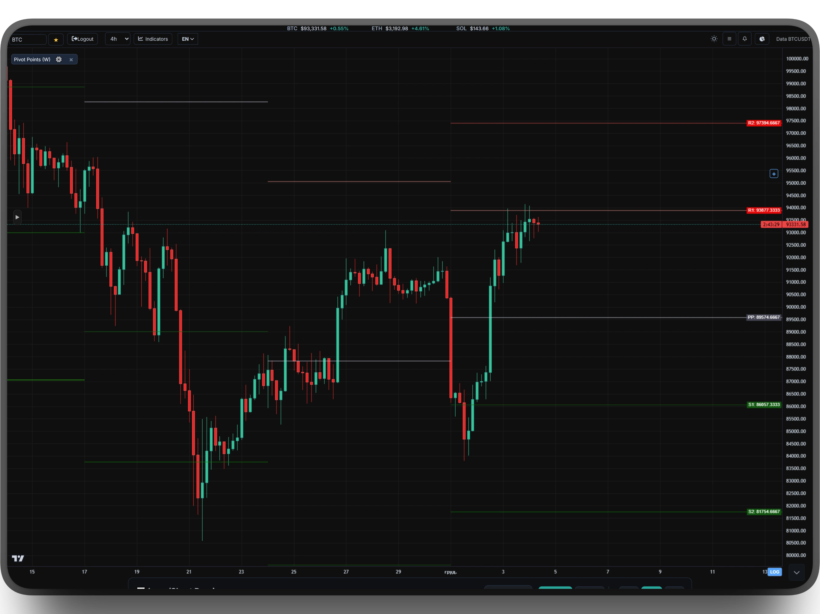
Pivot Points are mathematically calculated support and resistance levels based on the volatility of the previous period. The indicator automatically calculates 7 key levels based on the High, Low, and Close of the previous week, day, or month.
Our algorithm obtains historical data directly from the Binance API to get accurate High/Low/Close values. It then calculates the following using classic formulas:
• Pivot Point (PP) — the central level, the balance point.
• Support 1-3 (S1, S2, S3) — support levels.
• Resistance 1-3 (R1, R2, R3) — resistance levels.
🚀 RECOMMENDATION: It is best to use Weekly (W) Pivot Points. Weekly volatility provides:
• More stable and significant levels.
• Fewer false breakouts due to daily trading "noise."
• Long-term zones where whale liquidity gathers.
Trading Tactics
- PP — central point. Bounces from PP — entry into the trend.
- S1-S3 — support levels. Buy on bounces from S1/S2.
- R1-R3 — resistance levels. Sell on bounces from R1/R2.
- Breakout of PP — a signal for a trend change. Exit at S1 or R1.
- S3/R3 Zone — extreme levels. Often targets for large moves.
- Clustering: If several Pivot Points coincide — it's a super-zone.
ℹ️ Weekly Pivot Points are especially effective for swing trading and positional trading. They act as magnets for institutional players.
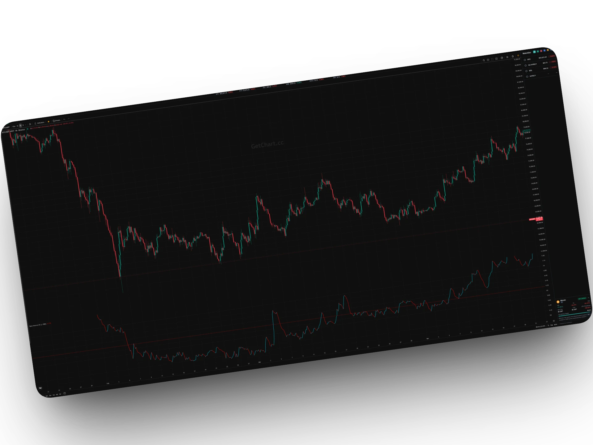
OI SMART ANALYZER
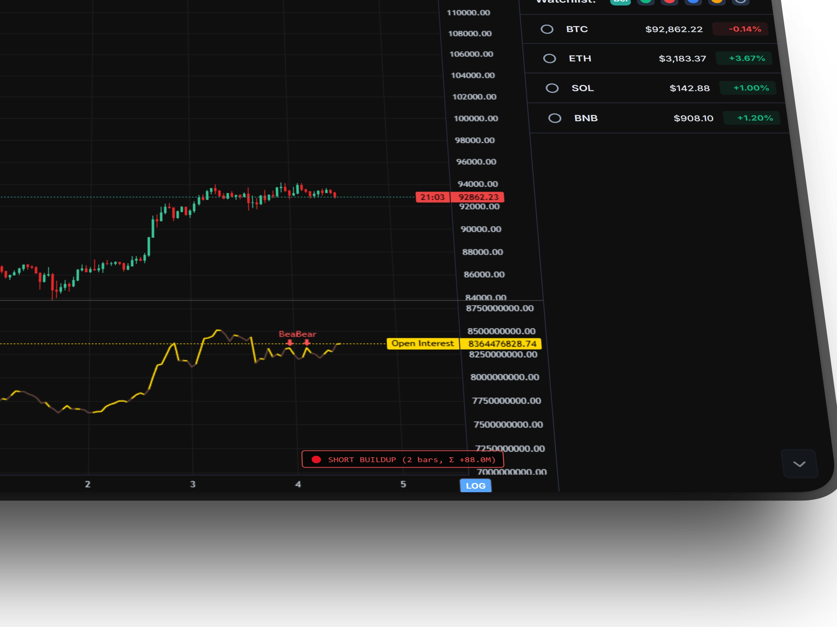
OI Smart Analyzer is a powerful tool for analyzing Open Interest dynamics in real-time. Unlike ordinary OI, this indicator automatically classifies 4 key market phases and tracks their duration and intensity.
The algorithm analyzes the ratio between price change and OI change for each candle and defines one of four market phases:
• Long Buildup — price ↑, OI ↑. Strong trend, new money entering longs.
• Short Buildup — price ↓, OI ↑. Strong trend, new money entering shorts.
• Long Liquidation — price ↓, OI ↓. Longs being liquidated, possible bounce.
• Short Cover — price ↑, OI ↓. Shorts being closed, possible continuation of the move.
The indicator automatically updates data every 5 minutes directly from the Binance Futures API, calculates the streak of consecutive phases, and the cumulative OI change for that period. The longer the streak — the stronger the market impulse.
The indicator also automatically searches for divergences between OI and price and marks them with "Bull" and "Bear" markers on the chart.
Market Phases
- Long Buildup (3 bars, Σ +5.2M) — the strongest bullish phase. New money in longs. Trade in the direction of the trend.
- Short Buildup (5 bars, Σ +8.1M) — strong bearish phase. New money in shorts. Trade down.
- Long Liquidation (2 bars, Σ -3.4M) — longs are closing. Possible bounce. Expect a phase change.
- Short Cover (4 bars, Σ -6.7M) — shorts are closing. Continuation of growth. Enter long.
- Streak (number of bars) — shows the duration of the phase. The longer — the stronger.
- Σ (cumulative OI change) — the total increase or decrease in open interest during the phase.
🚀 Effectiveness Secret: Trade only in Buildup phases (new money entering). Liquidation/Cover phases are signals of move completion.
IMBALANCE (FVG)
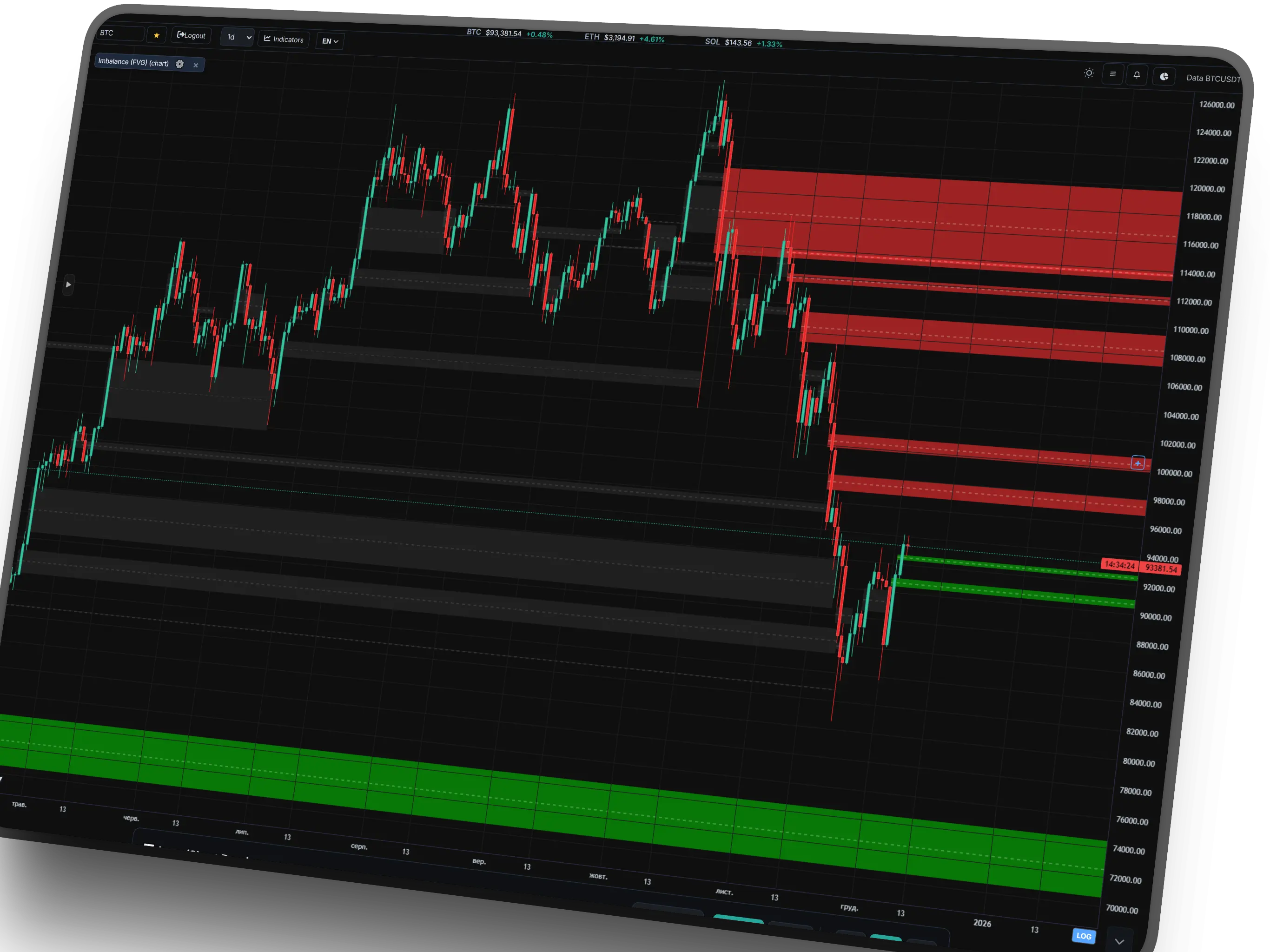
This is the primary weapon of trading "Jedi" and institutional players. The indicator automatically detects Imbalance zones (Fair Value Gaps) where aggressive capital injection by "Whales" occurred, causing the price not to trade fully. These zones act as the most powerful magnets — the market always aims to return there to restore balance.
The special value of the tool is Multi-Timeframe operation. You can see global Imbalance zones from the weekly (1W) or daily (1D) charts directly on the 5-minute timeframe. Weekly imbalances are the market's "concrete slabs" from which the price bounces with surgical precision.
Smart Money Logic
- Magnet Mode: Unfilled Imbalance attracts the price with >80% probability.
- Eqilibrium (50%): The strongest reaction occurs when touching the dashed line (the middle of the zone).
- Mitigation: When the price fills 50% of the zone, it fades — balance is restored.
- HTF Power: Higher Timeframe Imbalance is always stronger than a local pattern.
LINEAR TSI PANEL
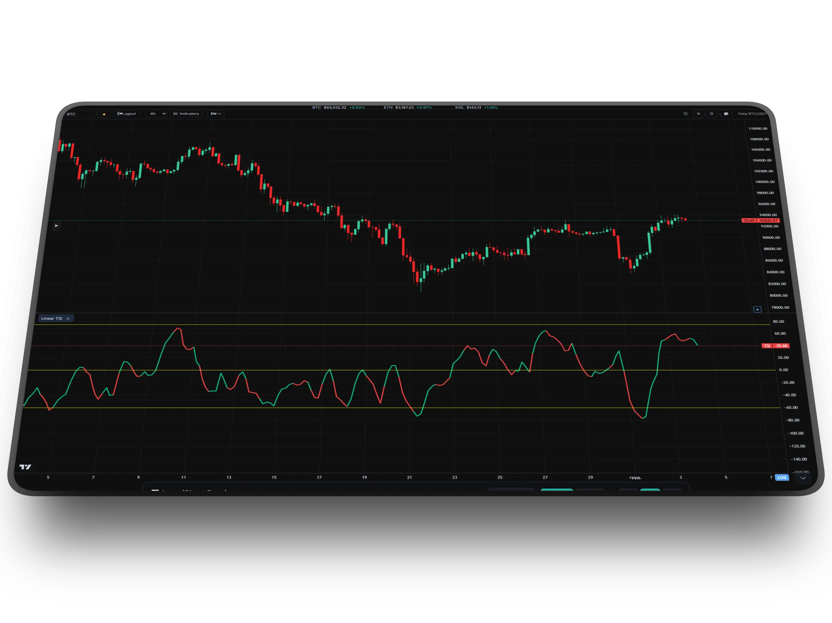
This is a surgically precise tool for detecting hidden market anomalies. Unlike standard oscillators, Linear TSI uses a linear regression algorithm to assess the angle of momentum. This allows it to react to a trend change much faster than MACD or RSI.
The main superpower of this indicator is the detection of large divergences. When the price continues to rise, but the TSI line begins to bend and change color to red — this is one of the most reliable signals of trend exhaustion and an impending reversal. It sees what is hidden behind the noise of price candles.
Signal Logic
- Divergences: The most powerful signal. A discrepancy between the direction of the price and TSI guarantees a strong correction.
- Green Line: Aggressive growth of momentum. Buys only.
- Red Line: Loss of bull strength. Time to take profit or look for a short.
- Zero Level: Crossing the 0 line confirms a change in the global trend.
LIQUIDATION BUBBLES
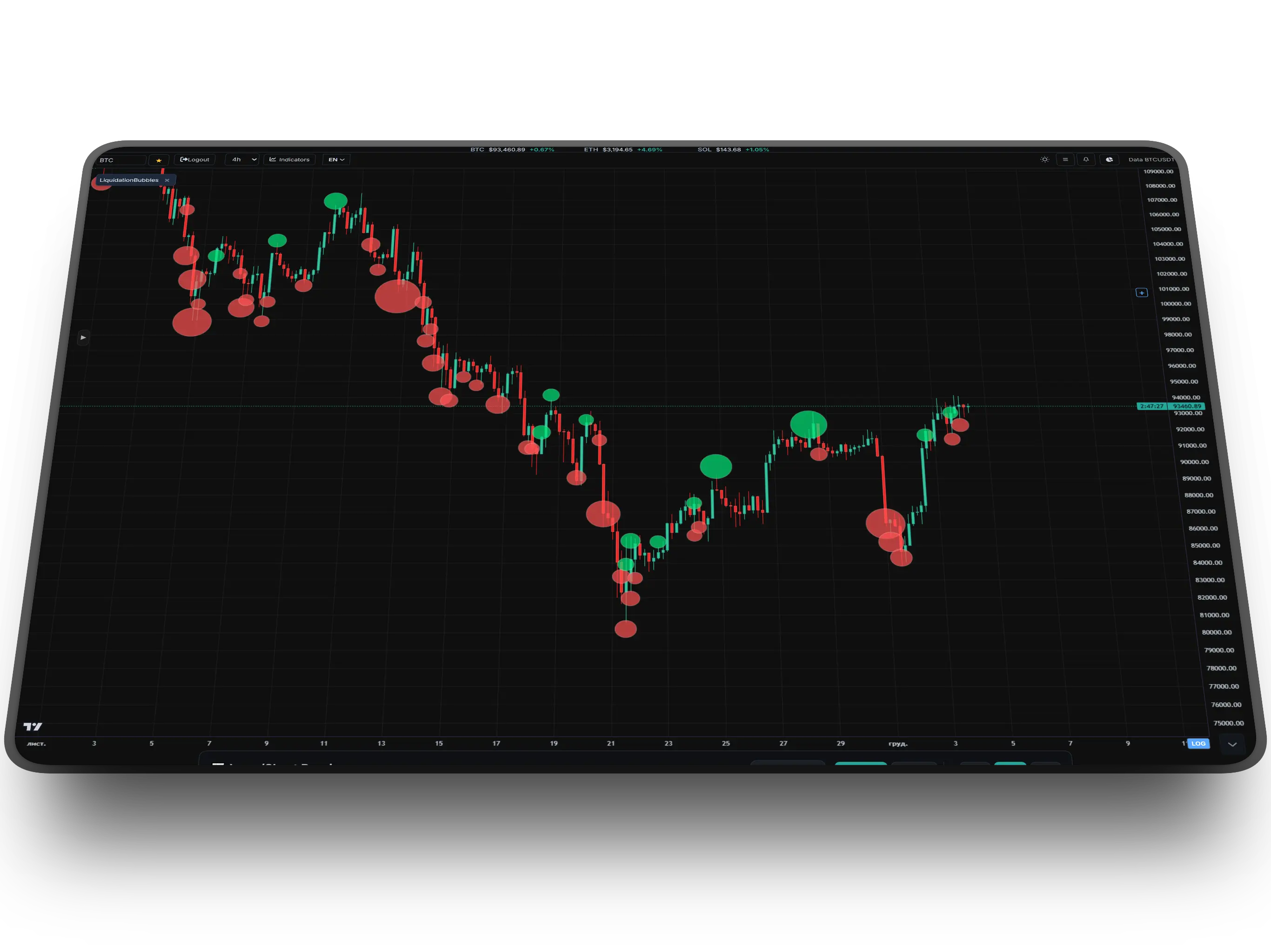
This tool visualizes the market's "pain" in real-time. Each bubble on the chart is a specific moment of forced liquidation of traders' positions. The size of the bubble is directly proportional to the volume of lost funds (in USD). This is the fuel on which the market moves.
The indicator allows seeing exactly where the market maker "swept" liquidity. Huge clusters of bubbles often become reversal points, as the fuel for continuing the move in that direction is exhausted. This is an ideal tool for counter-trend trading and determining local peaks and troughs.
How to read bubbles?
- Red (Longs Rekt): Liquidation of longs (selling). Often a signal of a local bottom (buyback).
- Green (Shorts Rekt): Liquidation of shorts (buying). Often a signal of a local top.
- Size: The larger the bubble, the stronger the reversal signal.
MACD PANEL
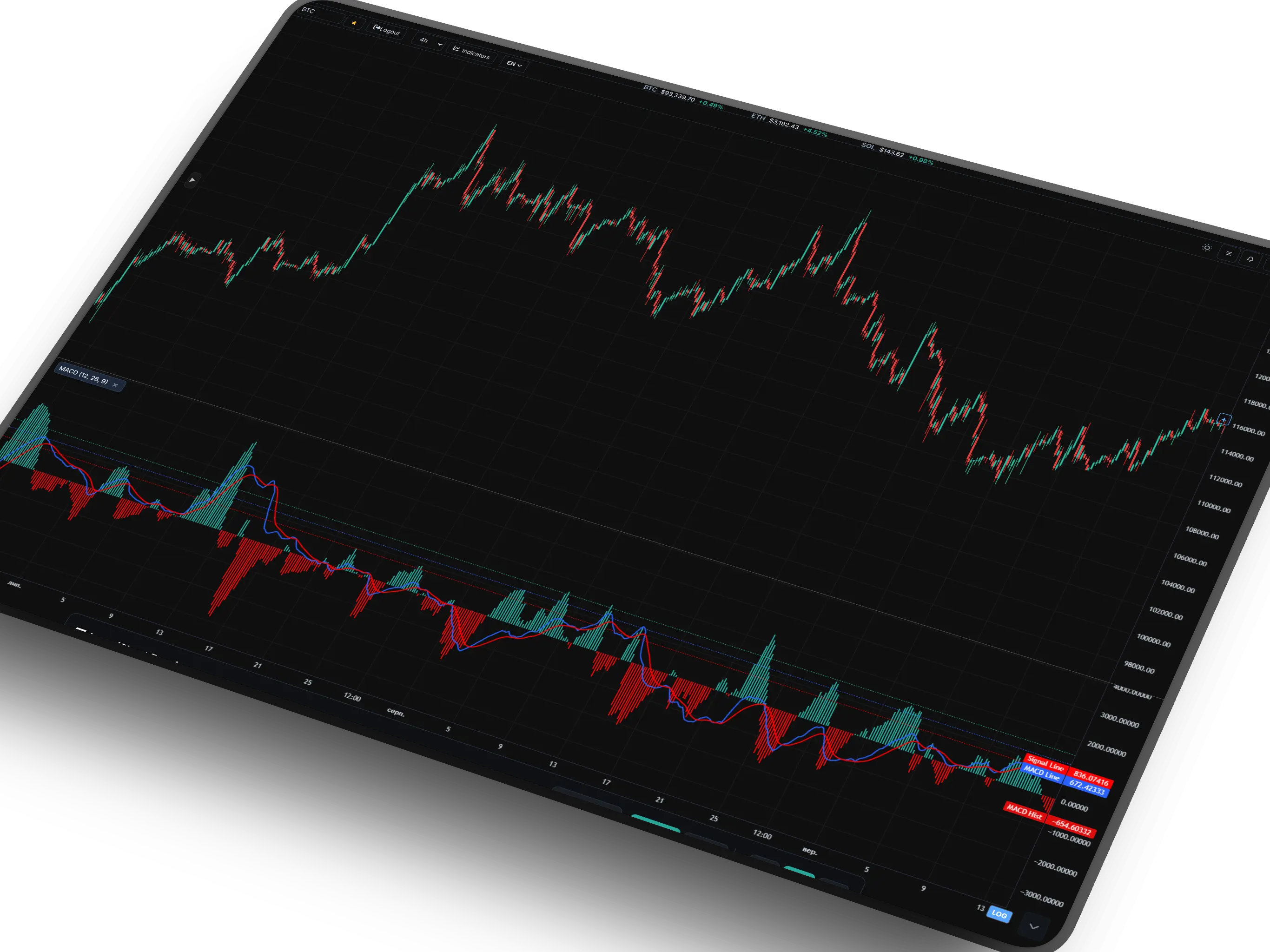
The legendary trend oscillator in a modern rendition. Besides determining the trend direction, professionals use MACD to search for divergences. If the price chart forms a higher high, but the MACD lines (or histogram) show a lower high — this is a "bearish divergence," often preceding a strong market crash.
The basis of the strategy is the interaction of the lines. When the fast line (MACD Line) crosses the slow signal line, it generates an impulse signal for entry. Crossing from bottom to top — a classic buy signal (Long), and crossing from top to bottom — a sell signal (Short), indicating the sellers have taken the initiative.
MACD Signals
- Crossovers: The crossing of the lines is the "trigger" for entering a trade.
- Divergences: The discrepancy between the price peaks and the indicator is the best reversal signal.
- Zero Line: Lines crossing 0 means a global change in trend (from bullish to bearish and vice versa).
GURU RSI TREND
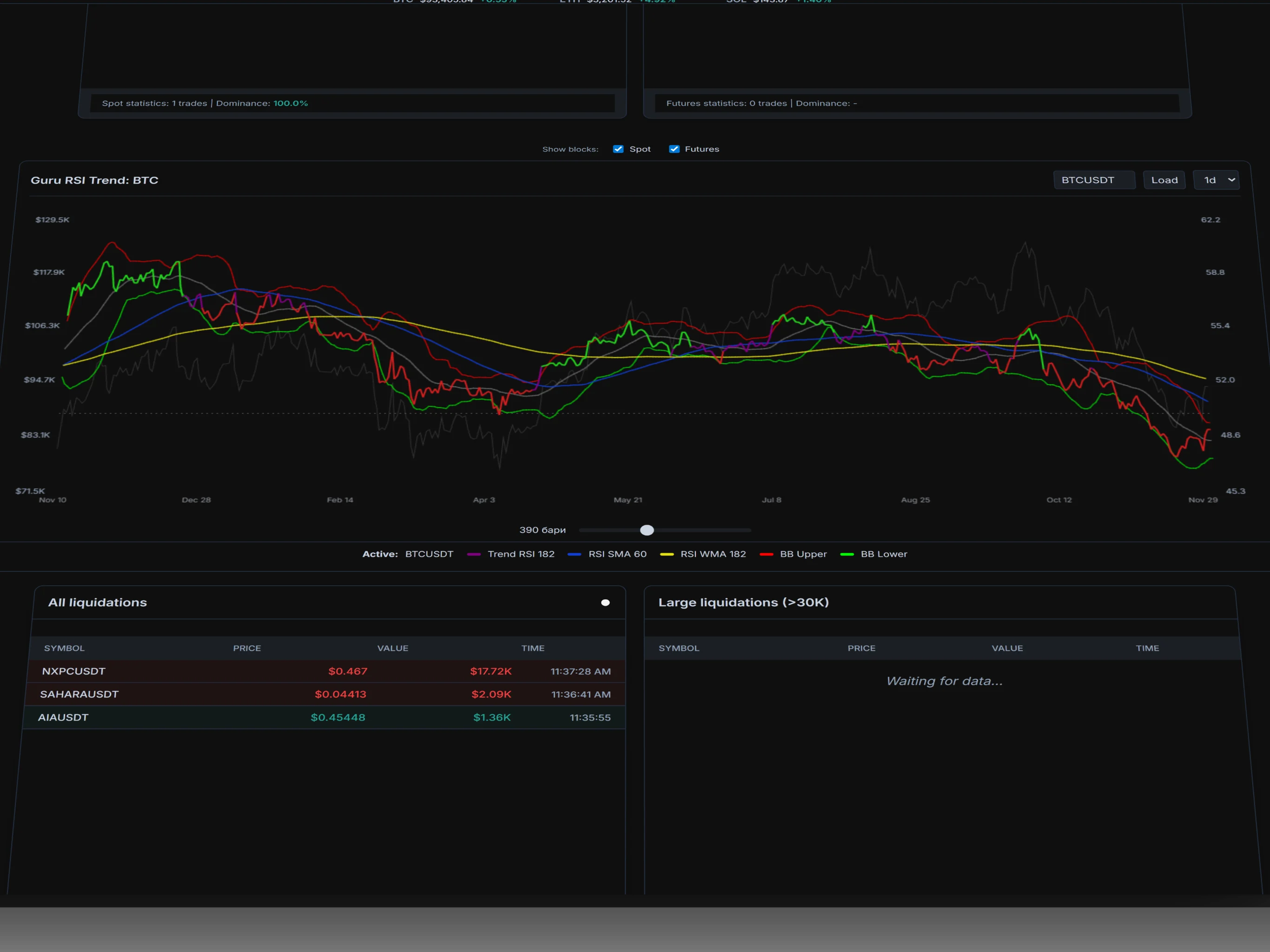
This is a fundamental indicator designed to assess the global state of the market. Unlike standard oscillators, it is configured for long periods (RSI 182) and works best on the daily timeframe (1D) for Bitcoin and altcoins.
Its main task is to separate market "noise" from the true trend. The indicator uses a system of "heavy" moving averages: Blue (SMA 60) and Yellow (WMA 182).
The interaction of the RSI line with these levels provides an understanding of the market phase. This is an ideal tool for finding global reversals and checking the strength of the trend through the "break-retest" mechanism.
Trading Logic
- Downtrend: RSI is BELOW the Blue and Yellow lines. Any rise here is only a correction.
- Uptrend: RSI has closed ABOVE the lines. This is a safe buying zone.
- Retest Pattern: If RSI breaks the lines down, then returns and bounces off them (cannot break back up) — this is "iron-clad" confirmation of the start of a bear market.
- Global Divergences: The strongest signal for a cycle change on the 1D chart.
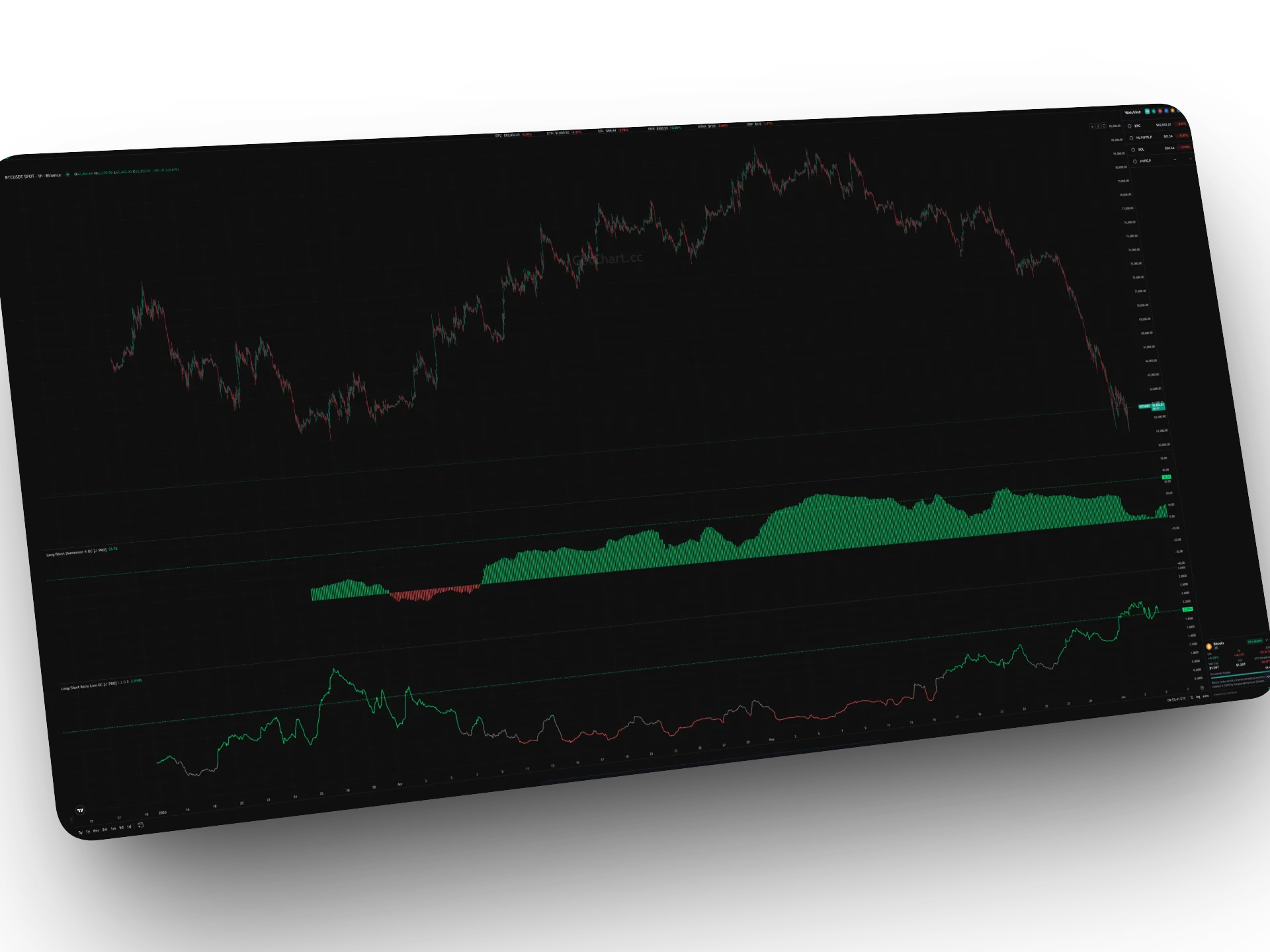
LONG/SHORT RATIO
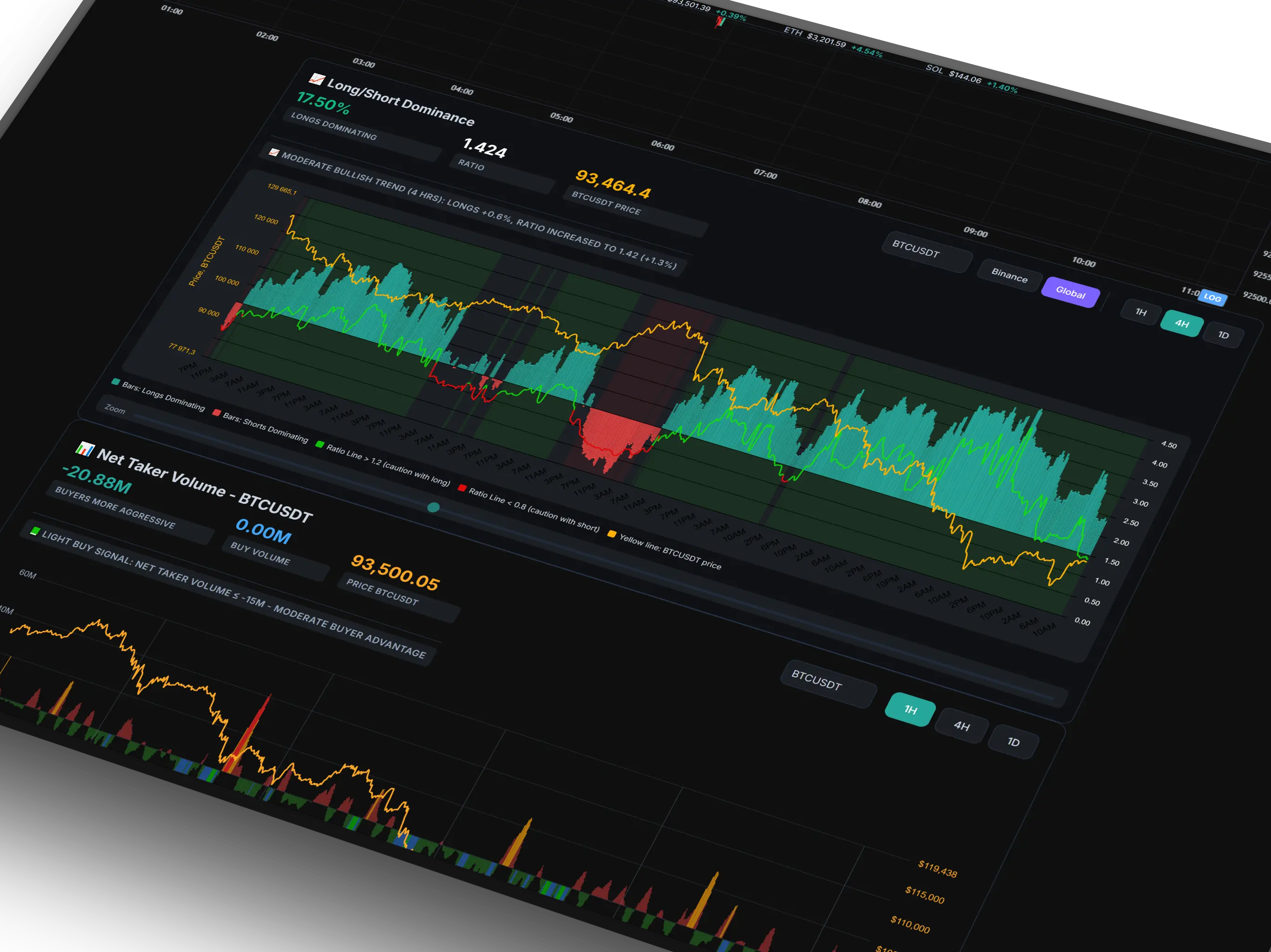
An exclusive custom development that allows "looking under the hood" of the market. The indicator displays the real actions of traders over time: who dominates now (bulls or bears) and where the big money is flowing.
A unique feature is the Binance / Global switch. You can analyze sentiment both on the world's largest exchange and aggregated data from the entire global market. This provides a complete picture without blind spots.
The histogram shows the percentage ratio of longs/shorts on each candle, and the Ratio line acts as the main indicator of "Smart Money."
How to read signals?
- Ratio Rises: Big players are aggressively accumulating Long positions. Signal for price growth.
- Ratio Falls: Smart Money are closing longs and accumulating Short. Signal for falling or correction.
- Bars (Dominance): Green bars — the crowd believes in growth. Red bars — the crowd is shorting (often this is fuel for an upward squeeze).
- Divergences: If the price falls, but the Ratio rises — this is the strongest signal for an upward reversal (whales are buying the dip).
NET TAKER VOLUME
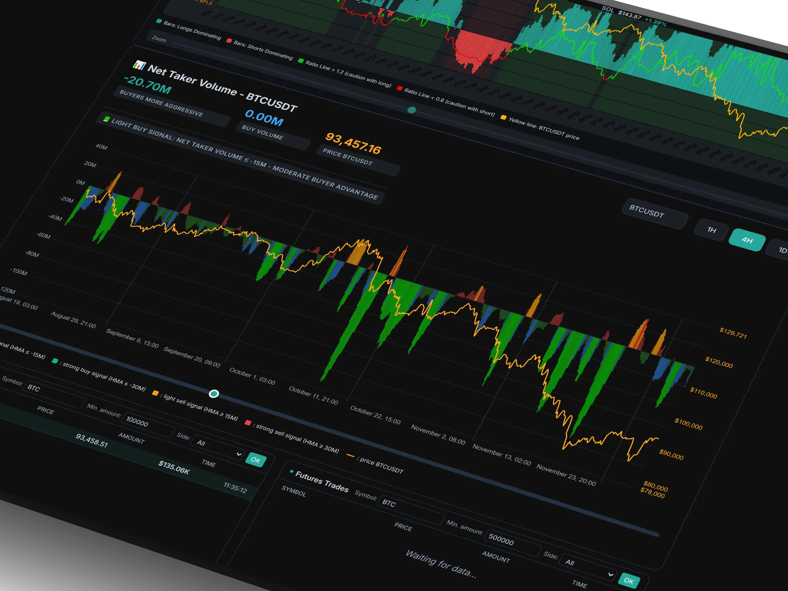
This is a professional Order Flow analysis tool that shows the true balance of forces in the market. The indicator downloads real trade data via the Binance API and calculates the difference between aggressive buys (Taker Buy) and sells (Taker Sell).
The data passes through a smoothing algorithm HMA (Hull Moving Average), which removes market noise and leaves only the clean movement of "Smart Money." You clearly see moments of culmination: when the crowd panically sells (an ideal time for whale buyback) or greedily buys (time to take profit).
🚀 RECOMMENDATION: The indicator shows the best results on the 4H timeframe for Bitcoin (BTC). This is the "gold standard" for determining medium-term reversals.
Signal Logic
- Green Bars (Strong Buy): Extreme crowd selling (Panic Sell). The market is oversold, whales start absorbing liquidity. Signal for growth.
- Red Bars (Strong Sell): Extreme crowd buying (FOMO). The market is overheated. Signal for falling or correction.
- Blue/Yellow Bars: Moderate zones of accumulation or distribution.
- Alerts: Set up alerts for the appearance of "Strong" signals to not miss the entry of a large player.
BID/ASK STRENGTH
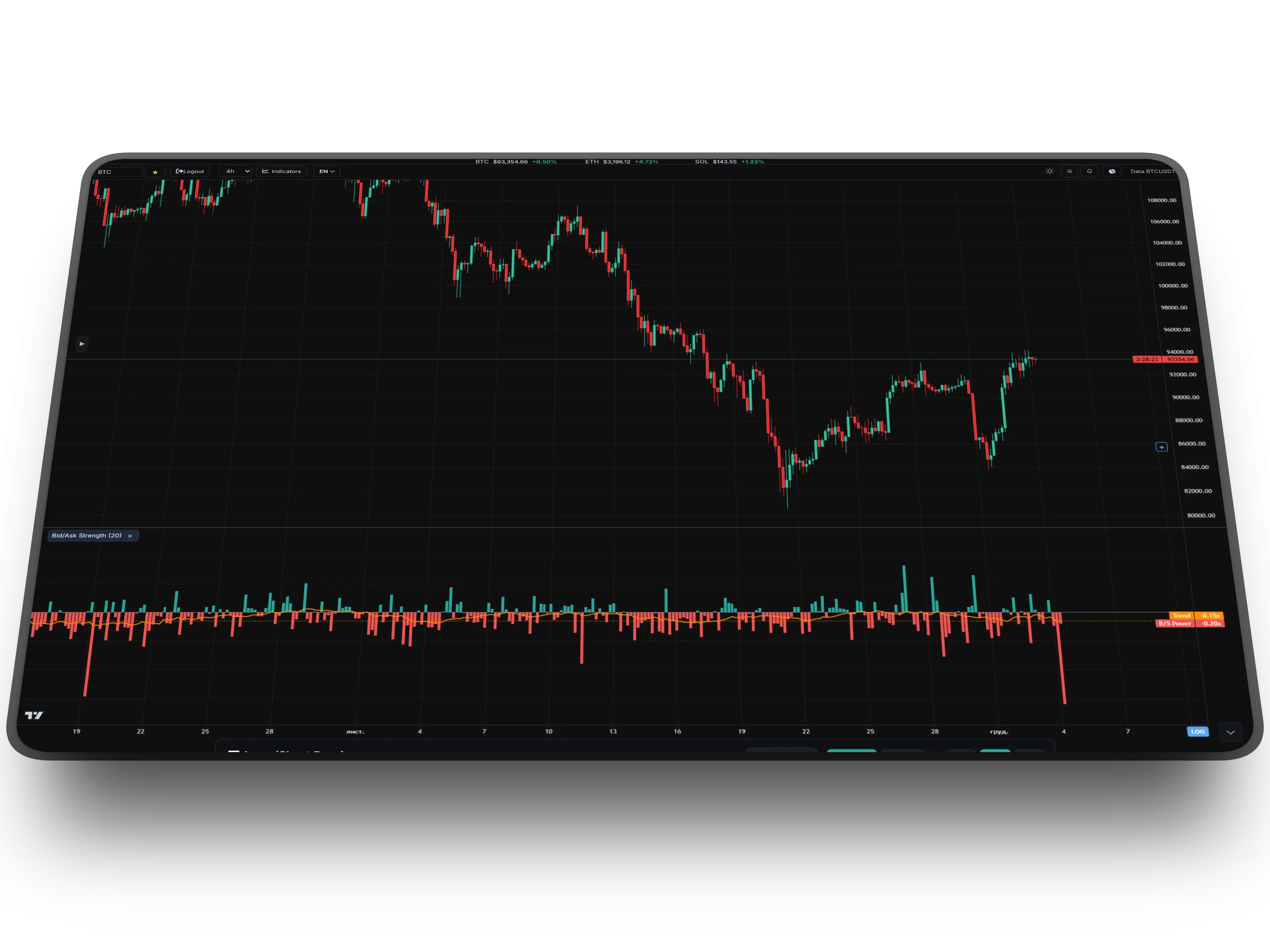
This indicator solves the main problem of volume visualization — the asymmetry of perception. It takes the ratio of market buys to sells and transforms it into a symmetrical histogram relative to the zero line.
If buyers are 2 times more, you will see a green bar +1.0x. If sellers are 2 times more (ratio 0.5), the indicator will draw a red bar -1.0x. This allows for an instant assessment of who is truly pressuring the price.
Additionally, an orange SMA line is overlaid on the chart, which smoothes the data and shows the true trend of the balance of forces, filtering out the noise of individual candles.
How to use?
- Green Zone (>0): Buyer dominance. Aggressive market orders hit the asks.
- Red Zone (<0): Seller dominance. Aggressive selling hits the bids.
- SMA Trend: If the histogram is above the SMA — the impulse strengthens. If below — it fades.
- Zero Cross: The SMA line crossing the zero line is the most reliable signal of a local trend change.
LIQUIDATION PANEL
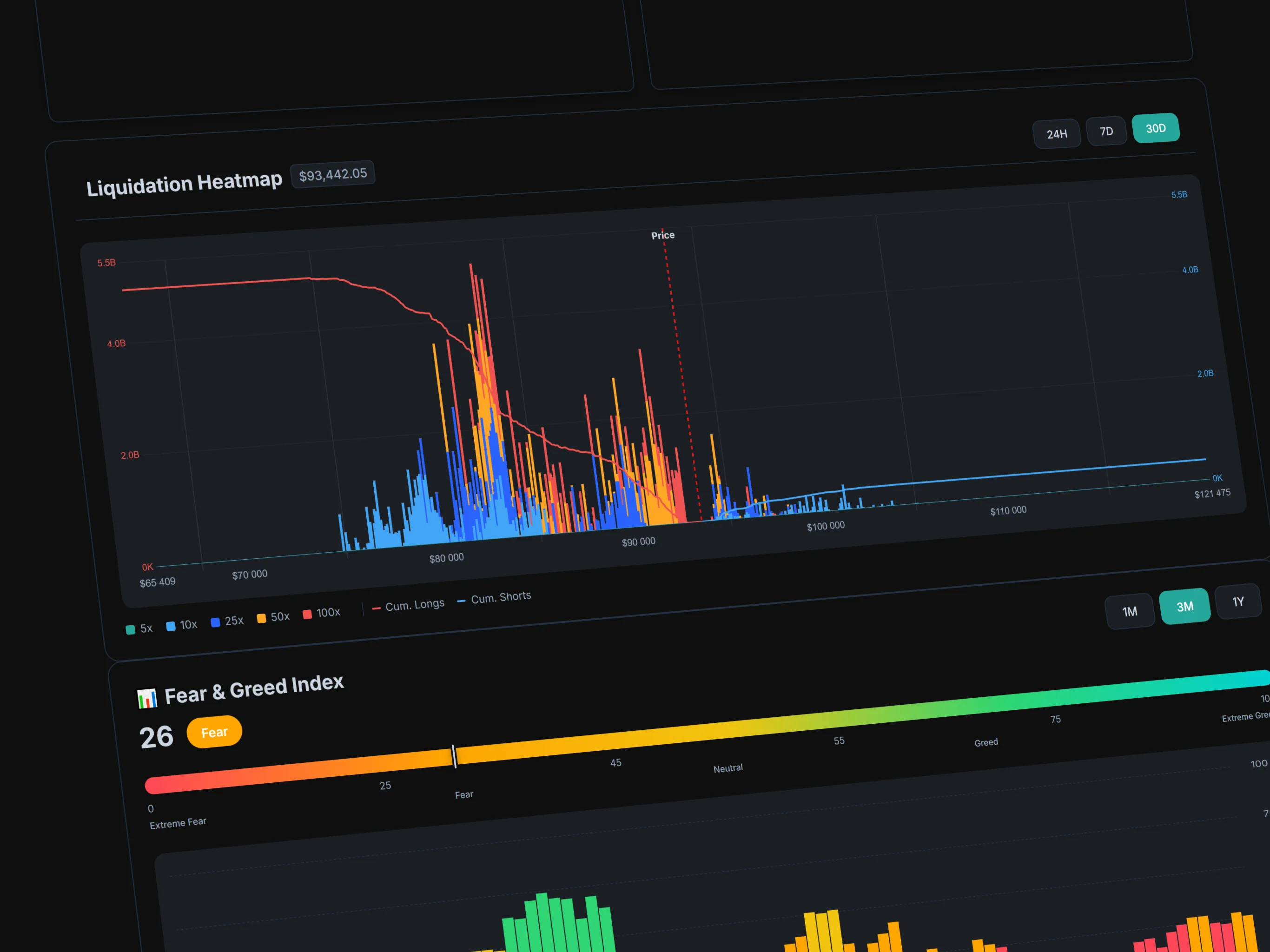
This panel visualizes the price levels where leveraged traders (from 5x to 100x) will face forced liquidation. These zones are the "magnets" for the market maker, as they contain the most liquidity.
The histogram is divided into colors corresponding to the leverage size (e.g., 100x — red, 25x — blue). The higher the bar — the more money is "buried" at that level.
A unique feature of our implementation is Cumulative Lines. The Red Line (Cum. Longs) shows the accumulated liquidation pressure from long traders (below the price), and the Blue Line (Cum. Shorts) — from short traders (above).
How to use?
- Magnetic Zones: Price often heads to the highest bars to "sweep" liquidity before a reversal.
- Ranges: Analyze 24H for scalping, 7D for swing trading, and 30D for global levels.
- Line Crossing: If the cumulative shorts line sharply rises above the price — a high probability of a Short Squeeze (a sharp jump up).
SQUEEZE PREDICTOR (OI + FUNDING)
Squeeze Predictor is an innovative tool that combines the analysis of Open Interest (OI) changes and Funding Rates to identify zones of increased risk for margin trader capitulation (Squeeze).
The indicator calculates the dynamics (delta) of OI and gauges market sentiment based on funding. It shows the probability of sharp impulsive moves: when the crowd massively enters positions with high leverage, and large players (whales) are preparing a "trap" to liquidate them.
How to Read Signals?
- Bright Red: Aggressive accumulation of longs. Risk of a Long Squeeze (sharp drop).
- Light Red: Capitulation of long positions (long liquidations).
- Bright Green: Aggressive accumulation of shorts. Risk of a Short Squeeze (sharp rise).
- Light Green: Capitulation of short positions (short covering).
WHALE ORDERS (DOM)
Whale Orders displays the density of limit orders from the Depth of Market (DOM) of leading exchanges (Binance, Bybit, OKX, Coinbase). This indicator allows you to visually see order walls directly on the price chart, where whales are defending levels or attempting to manipulate the price.
The indicator aggregates data from spot and futures markets, filtering out the "noise" and leaving only large (Whale) volumes. Each level is automatically colored based on its significance (Mega-levels become more vibrant), and you can view the details in a convenient DOM table. These zones act as a magnet for price or as "concrete" support/resistance.
Smart Money Logic
- Green Lines: Clusters of limit buy orders (Bids). Form strong support.
- Red Lines: Clusters of limit sell orders (Asks). Form strong resistance.
- Mega-levels (🐋): Particularly large orders exceeding a threshold (e.g., >$500k).
- Interactive Panel: The DOM interface allows you to track order levels across exchanges in real-time.
MACDIVER GC
MacDiver GC is a powerful tool specifically designed and intended for identifying large divergences in the market. It helps track moments of trend exhaustion when the price movement is no longer confirmed by volume or momentum.
By analyzing discrepancies between the price and the indicator's histogram, MacDiver enables the detection of early reversal signals. It is a key tool for traders looking for major trend changes after a prolonged rise or fall.
How MacDiver Works
- Divergence Finding: Its main task is to find hidden and regular (large) divergences between price and the histogram.
- Major Reversals: Perfect for long-term trades and "catching" the start of a new strong trend.
- Confirmation: Reliably signals when the momentum of buyers or sellers is exhausted.
VIBETREND GC
VibeTrend GC is an advanced oscillator that automatically highlights divergences on the chart. Like MacDiver, it is ideal for finding large divergences, but features a built-in auto-detection system with clear, bright signals.
One of the main advantages of VibeTrend is the presence of its own signal line (EMA). It acts as an infallible trend filter: if the indicator values are below this line — the global trend is considered bearish. If the values are fixed above the line — the trend is bullish, and you can confidently hold the position.
VibeTrend Logic
- Auto-Divergences: The indicator itself highlights potential reversal points on the chart with BULL and BEAR marks.
- Signal Line: The most important trend filter. Below the line — bear market, above it — bull market.
- Major Reversals: Use it to find massive divergences on higher timeframes.
FUNDING RATE GC
Funding Rate GC — is an indispensable analytical tool for derivatives traders that automatically displays the funding rate directly below your working chart. The indicator independently finds the required funding ticker and synchronizes it time-wise with any selected timeframe.
The funding rate reflects the balance of power between buyers and sellers in perpetual futures. The indicator visualizes this data as an intuitive two-color histogram relative to the zero line, allowing you to instantly assess market sentiment and identify critical market overheating zones where price reversals and liquidations most frequently occur.
Funding Rate Logic
- Positive Funding (Cyan): Value above 0. Longs pay shorts. Bullish sentiment dominates the market, but excessively high bars warn of overheated longs.
- Negative Funding (Red): Value below 0. Shorts pay longs. A sign of strong bearish pressure, while extreme values often signal panic and a nearby local bottom.
- Auto-Synchronization: The indicator automatically adapts historical funding data to the current time and candles of the main chart.
OPEN INTEREST GC
Open Interest GC — is a powerful analytical tool that displays the total number of open positions (both long and short) in the futures market for the current asset. The indicator automatically finds the corresponding OI ticker and plots it directly beneath the price chart.
The main highlight of this indicator is its **dynamic color-coded trendline**. Instead of a standard solid curve, the line instantly reacts to volume changes in real time. This allows you to immediately read whether new money is entering the market (fueling the price movement) or if current players are heavily taking profits and closing their positions.
Open Interest Logic
- OI Increase (Blue line): The number of open contracts is increasing compared to the previous bar. New money is entering the market. Combined with price movement, this confirms the strength of the current trend.
- OI Decrease (Red line): Traders are heavily closing deals and moving into cash. The current price movement is losing support and may indicate trend exhaustion or an imminent local reversal.
- Precise Sync: A special internal buffer ensures perfect alignment of linear fluctuations with each candle on the main chart.
CVD DELTA GC (SPOT / FUTURES)
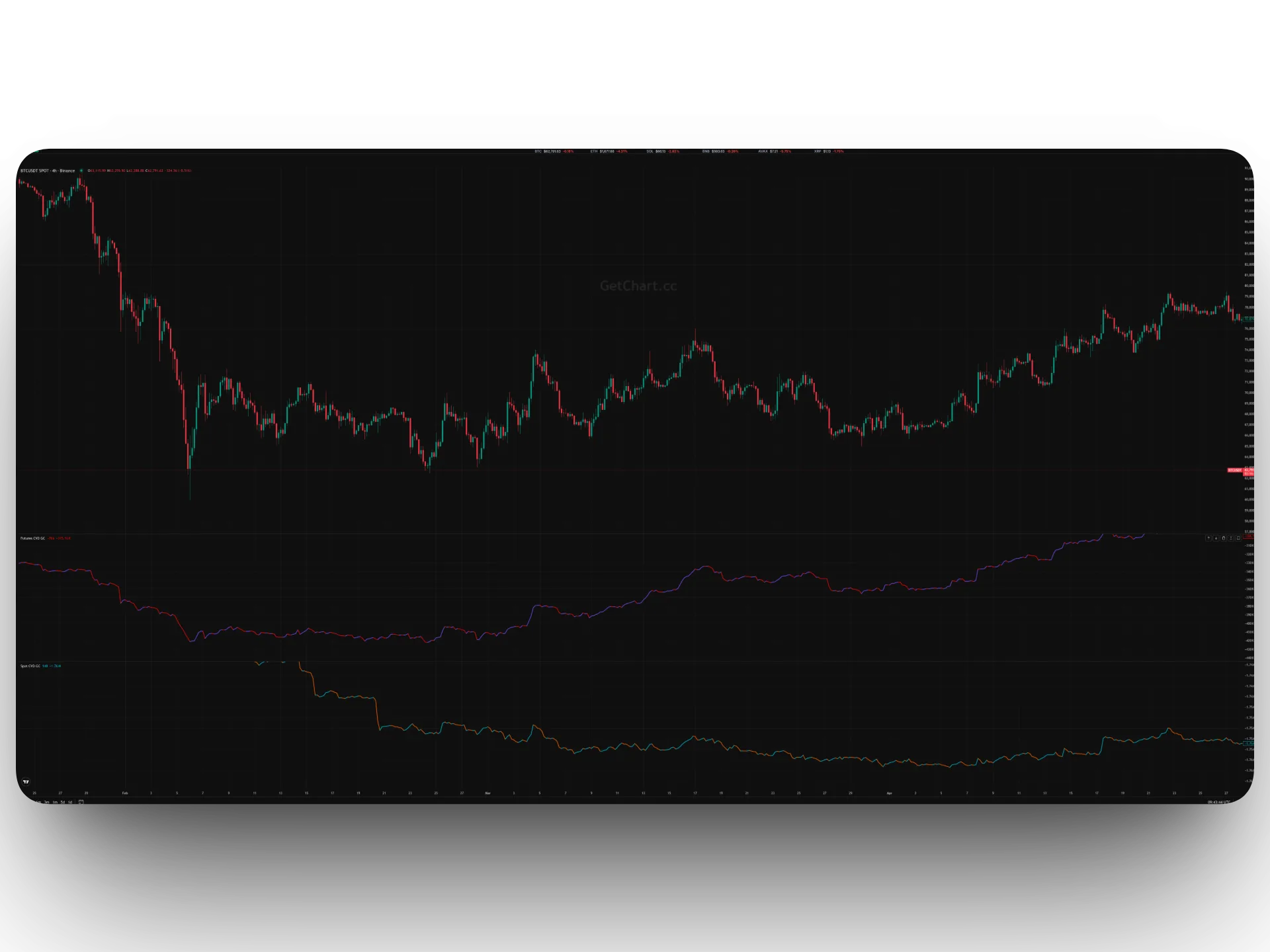
CVD Delta GC — represents professional volume analysis tools that track the Cumulative Volume Delta of market buys and sells (CVD). The indicators are split into two types: Spot CVD (analyzes net capital and investor interest) and Futures CVD (shows speculative interest and leverage position deltas).
The primary advantage of both indicators is **autonomous data filtering**. No matter which exchange chart you have open, the algorithm automatically strips prefixes/suffixes from the ticker and fetches precise Taker data directly from the benchmark Binance market. Each indicator combines two elements: a delta histogram for each individual candle and a cumulative CVD line that displays the ongoing balance of power in real time.
Indicator Logic & Operation
- Spot CVD (Blue / Orange): Displays real buys (Blue) and sells (Orange) on the spot market. Steady growth in spot CVD indicates long-term asset accumulation by large players.
- Futures CVD (Purple / Red): Shows the aggressiveness of market buyers (Purple) and sellers (Red) on futures. Helps detect traps, gridlocks, and aggressive market pressure from speculators.
- Divergence Hunting: If the asset price hits a new local high while the CVD line is dropping (or vice versa), it signals heavy exhaustion of the current trend and a forthcoming reversal.
- Flexible Customization: In the settings, you can independently toggle the visibility of the CVD line or the histogram bars, as well as manually replace the symbol via the Override field.
SMART VOLUME PROFILE GC
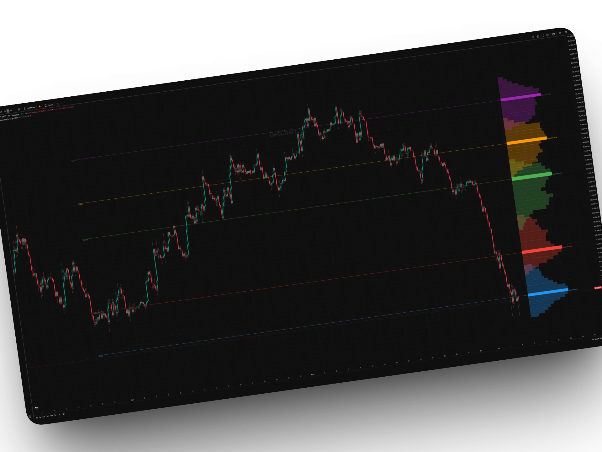
Smart Volume Profile GC — is a unique, next-generation volume analysis tool powered by AI elements — specifically the K-Means clustering algorithm. Instead of calculating a standard profile across the entire screen, this indicator automatically groups price zones based on the concentration of traded volume.
The indicator independently breaks down the chosen historical period into distinct price clusters, plotting a local Volume Profile for each one directly on the right margin of the chart. For every cluster, its core hub is mathematically calculated — the POC (Point of Control) line, which acts as the strongest support or resistance level where capital was heavily concentrated.
Logic & Settings
- K-Means Clustering: The mathematical engine divides the price into several independent zones (via the Number of Clusters setting). Each zone is assigned a unique color from the palette.
- Local POC Levels: The indicator automatically plots a horizontal line across the history from the inception of the cluster accumulation, labeling the precise volume of the maximum horizontal bar (POC).
- Informative Labels: The right edge of each zone displays the cluster's total traded volume (Total Volume), allowing you to evaluate the capitalization of each consolidation area.
- Smart Scaling: Utilizes a non-linear function to render the profile. This lets you clearly see even weak volume levels inside narrow consolidations that typically get lost against massive inflows.
MATRIX TRUE FLOW VZO GC
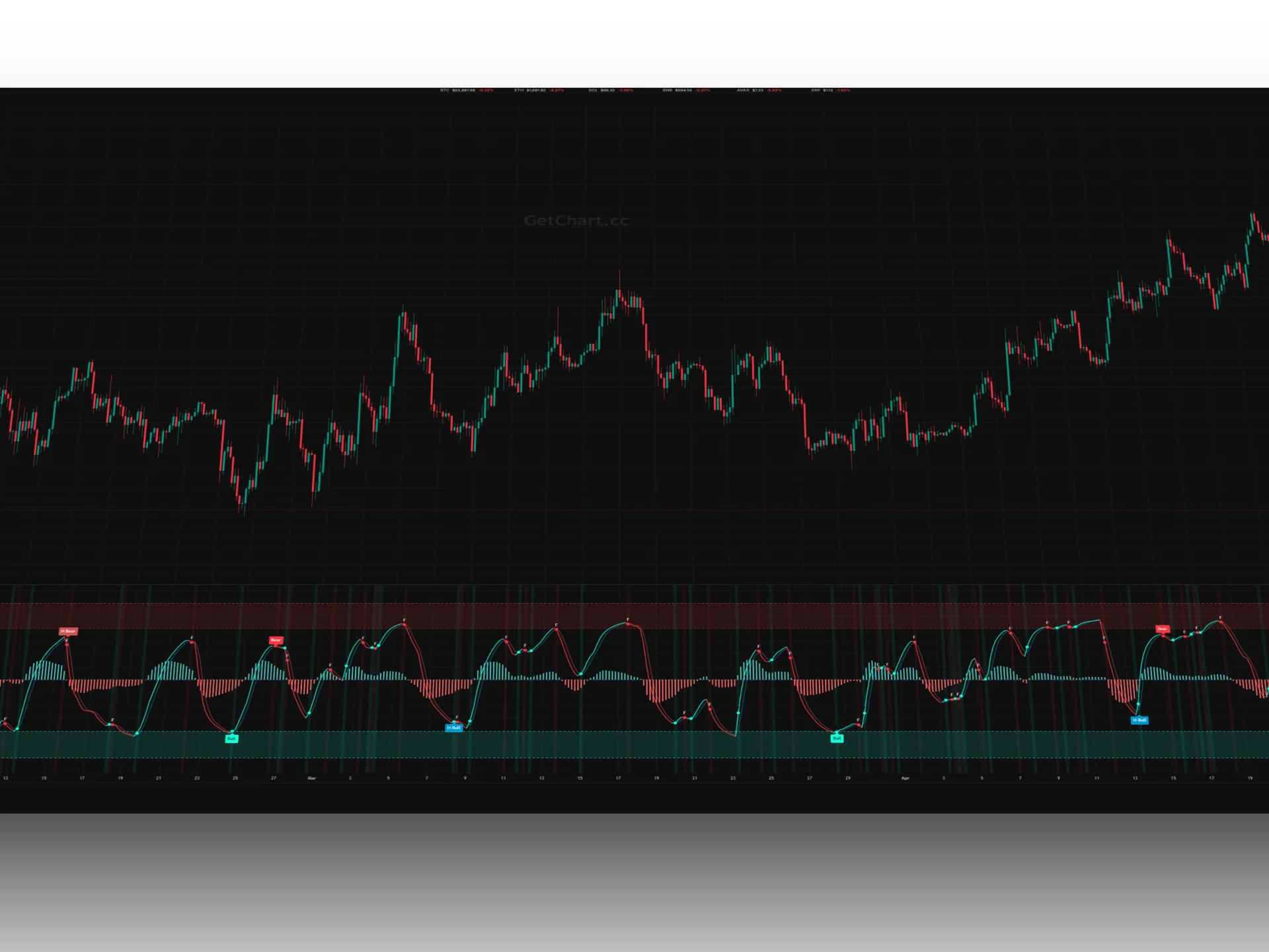
Matrix True Flow VZO GC — is an elite oscillator suite that takes market momentum and volume analysis to a mathematically superior level. It is built on the Volume Zone Oscillator (VZO) algorithm, radically enhanced with Fourier filtering and the ADF statistical coefficient to neutralize market noise.
The indicator doesn't just track overbought or oversold conditions; it monitors "net capital inflow" through the Flow Momentum line. It instantly highlights local trend shifts (via Flip dots) and automatically scans the chart for classic and hidden divergences between price and actual money flow volumes.
VZO Components & Signals
- Main VZO Line: Dynamically shifts color. Cyan line indicates capital entering the asset (Up-trend), red means capital is exiting (Down-trend).
- Flow Momentum: A histogram acting as a leading indicator of move strength. Bars above zero confirm steady buyer dominance.
- FLIP Points ("F" Markers): Appear directly on the oscillator line at the exact moment a local trend breaks (when the line reverses in the opposite direction).
- Auto-Divergences: Automatically marks the chart with labels: Bull and H-Bull for upward reversals, or Bear and H-Bear for downside signals.
- Critical Ext Zones: Extreme cutoff levels (±80 and ±120) clearly distinguish trend exhaustion zones, where player capitulations most frequently occur.
SNIPER WICKS DELTA GC
Sniper Wicks Delta GC — is a highly efficient cluster-volume scanner designed to pinpoint massive market anomalies within candle wicks (tails). Instead of scrolling through a cumbersome footprint tape, this indicator automatically uncovers zones of extreme buying or selling pressure and visualizes them as neon bubbles directly on the chart.
The algorithm operates on a dual-filter approach: it evaluates the length of the candle shadow relative to its body while simultaneously calculating the net order delta inside that tail, sourcing accurate Taker data from Binance. Thanks to a high-tech Canvas bridge, hovering over any bubble reveals an interactive window with detailed parameters of the traded volume and delta within that split-second zone.
Signal Modes & Colors
- Trend Buy (Blue): Bullish momentum. A rising candle with a large lower wick and positive delta. Represents aggressive, strong defense by buyers and market order absorption ("at the market").
- Trend Sell (Bright Red): Bearish momentum. A falling candle with a large upper wick and negative delta. Signals heavy market pressure from sellers at local highs.
- Trapped Buyers (Purple): Long trap (Reversal). A falling candle with a large upper wick but positive delta. This means buyers bought aggressively at the very peak, but a large seller filled their market orders via limit orders, trapping long players into a drawdown.
- Trapped Sellers (Neon Green): Short trap (Reversal). A rising candle with a large lower wick but negative delta. Indicates that massive market selling occurred at the absolute bottom, which was fully absorbed by a limit buyer, signaling an upward reversal.
- Mobile Optimization: The graphics engine automatically detects smartphones, disabling heavy neon blur effects to maintain maximum smoothness and preserve battery life.
SCALPER PRINT GC
Scalper Print GC — is an ultra-professional volume analysis tool for derivatives that unveils the inner structure of candlesticks, transforming each into a comprehensive Footprint chart. Instead of just viewing a standard candle close, you get an X-ray snapshot of the market showing the exact amount of traded market longs and shorts at every single price level.
The indicator features a powerful Canvas engine that calculates market imbalances in real time, automatically highlights primary accumulation levels, and constructs a lateral dynamic Volume Profile Visible Range (VPVR) with precise mathematical definition of the Value Area and the VPOC (Volume Point of Control) line. This allows scalpers and intraday traders to monitor the covert operations of institutional capital without relying on external third-party terminals.
Features & Smart Levels
- Volume X-Ray (Footprint): Rectangular blocks inside the candles adjust color intensity based on traded volume, spotlighting areas of peak interest for buyers or sellers.
- nPOC Levels (Naked POC): Automatically captures untested maximum volume levels from past candles and extends a line until the current price mitigates it, marking powerful price magnets.
- Market Imbalances: If one side's dominance exceeds the designated Imbalance Ratio, the block borders are highlighted with a bright neon marker, signaling an aggressive initiative.
- Absorption Channels (EMA): Smooth lines framing the profile, calculated as an exponential deviation from the POC to the candle edges. They form a continuous, dynamic support and resistance channel.
- Absorption Points: Vibrant dots on the channel boundaries signal moments when institutional limit orders completely absorbed and halted aggressive market thrusts from the crowd.
LONG/SHORT RATIO & DOMINANCE GC
Long/Short Ratio & Dominance GC — is a comprehensive market sentiment analysis tool that displays the ratio of open positions between buyers and sellers. Instead of guessing market participant positioning, you get direct data showing exactly which way the majority of capital is positioned in the futures market.
The suite consists of two complementary modes: **linear ratio evaluation** and a **dominance histogram**. The algorithm automatically locates the relevant LSR ticker for the current asset, syncs it time-wise, and allows you to instantly pinpoint phases of extreme positional skew, which market makers frequently exploit to sweep liquidity and trigger short/long squeezes.
Modes & Analytical Logic
- L/S Ratio Line: Shows the pure mathematical ratio. When the value crosses the upper threshold (Upper Zone, default 1.2), the line turns green — indicating heavily overheated longs. When it drops below the Lower Zone (default 0.8), the line turns red — showing shorts are in an extreme majority.
- L/S Dominance % (Histogram): Visualizes the dynamic percentage difference between longs and shorts. Positive green bars indicate net buyer dominance at the moment, while negative red bars indicate seller dominance.
- Trap Detection (Reserve Color): If the price continues to drop while the Ratio line or histogram remains in the critical green zone, it reveals "trapped" longs whom the market is highly likely to drive toward liquidation.
- Full Autonomy: Both indicators utilize High/Low/Close smoothing buffers to ensure accurate rendering on any selected timeframe.